
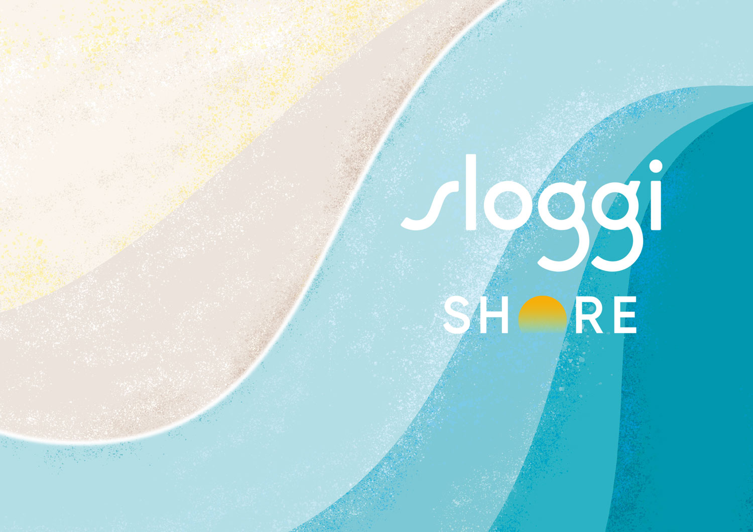
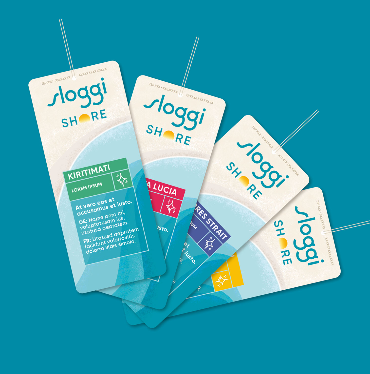
Sea waves gently crash on the shoreline, a logo lock-up reminiscent of the sun setting on the horizon line, instantly reminding us of long days spent on the beach'.
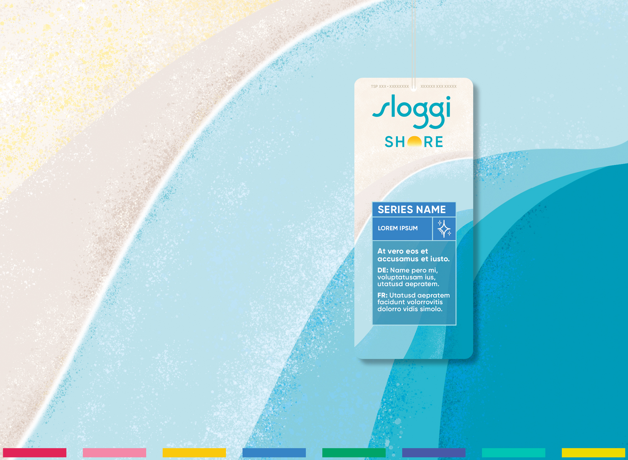
I retained key visual assets from the brand world — notably the oversized Super 'S' — to maintain consistency, while introducing fresh, confident colour cues to reflect the category's summer energy. The final design strikes a balance between shelf impact, brand alignment, and product clarity.
All work created whilst working at Mullen Lowe agency, London.


